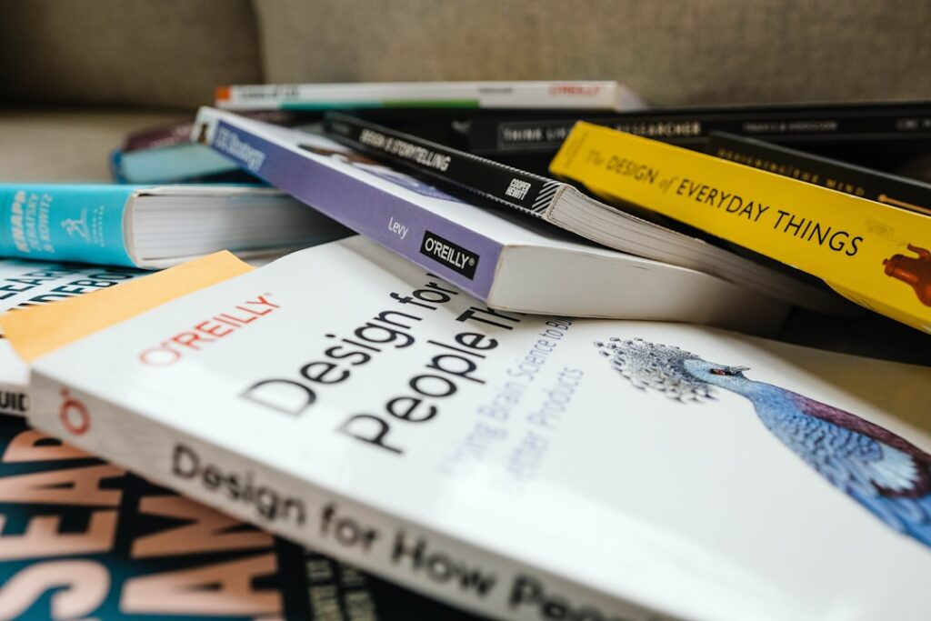
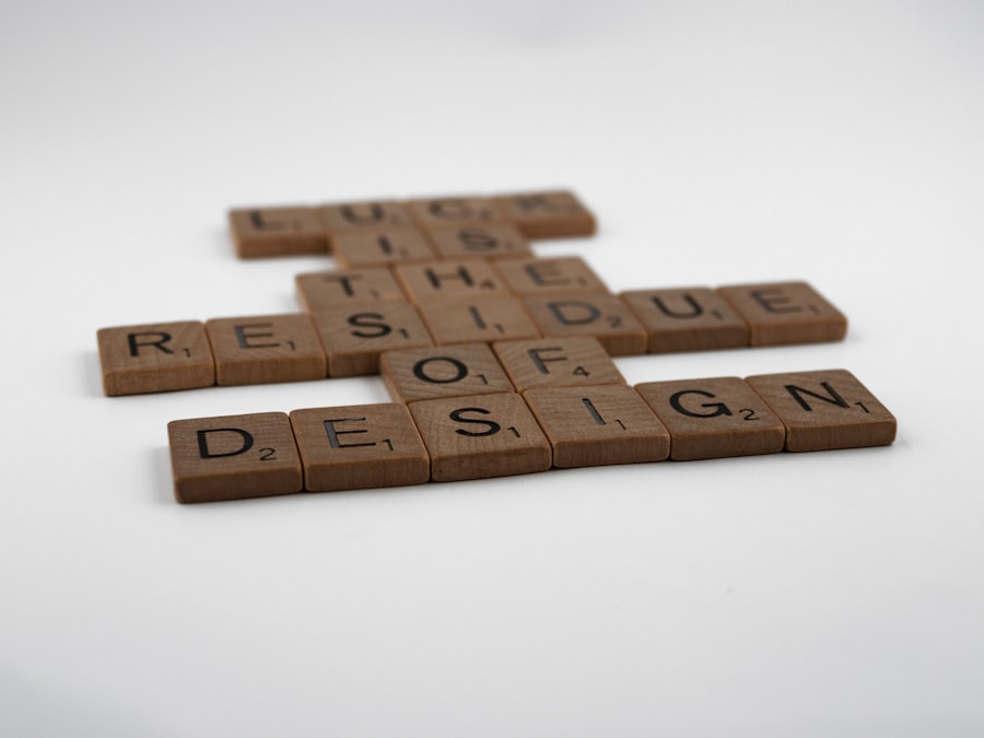
In the realm of design, the gap between professional designers and those who consider themselves non-designers can often feel insurmountable. However, “The Non-Designer’s Design Book” by Robin Williams serves as a bridge, offering accessible insights into the fundamental principles of design that anyone can grasp and apply. This book demystifies the often intimidating world of design, making it approachable for individuals who may not have formal training but wish to enhance their visual communication skills.
Williams emphasizes that good design is not solely the domain of the artistically inclined; rather, it is a skill that can be learned and refined through understanding key concepts. The book is structured around four essential principles: contrast, repetition, alignment, and proximity—often referred to as the CRAP principles. These foundational elements serve as a guide for creating visually appealing and effective designs.
Williams illustrates how these principles can be applied across various mediums, from print to digital, empowering readers to create designs that are not only aesthetically pleasing but also functional. By breaking down complex ideas into digestible segments, Williams equips non-designers with the tools they need to communicate their messages more effectively through design.
Key Takeaways
- The Non-Designer’s Design Book provides a comprehensive introduction to design principles for beginners.
- Understanding basic design principles such as balance, contrast, and alignment is crucial for creating visually appealing designs.
- Typography plays a key role in design and understanding how to apply design principles to typography can greatly enhance the overall look and feel of a design.
- Using contrast and repetition in design can help create visual interest and guide the viewer’s eye through the design.
- Understanding the importance of alignment and proximity in design can help create a sense of organization and cohesiveness in a design.
Understanding the basic principles of design
At the heart of effective design lies an understanding of its basic principles. These principles serve as the building blocks for creating visually coherent and engaging compositions. The first principle, contrast, involves the juxtaposition of differing elements to create visual interest and draw attention.
For instance, using a bold typeface against a light background can make a headline stand out, guiding the viewer’s eye to important information.
Repetition is another critical principle that reinforces unity and consistency within a design.
By repeating certain elements—such as colors, shapes, or fonts—designers can create a cohesive look that ties various components together. For example, a website might use the same color palette and button styles throughout its pages to establish a recognizable brand identity. This repetition not only enhances aesthetic appeal but also aids in navigation, as users become familiar with the visual cues that guide them through the content.
Applying design principles to typography

Typography is a vital aspect of design that goes beyond mere text presentation; it encompasses the art of arranging type to make written language legible, readable, and visually appealing. The application of design principles to typography can significantly impact how information is perceived and understood. For instance, contrast in typography can be achieved by varying font weights or sizes to create a hierarchy of information.
A larger, bolder font can signify headings or important points, while smaller, lighter fonts can be used for body text, ensuring clarity and readability. Moreover, repetition in typography involves maintaining consistency in font choices throughout a design project. This consistency helps establish a visual rhythm that guides the reader’s experience.
For example, using the same font family for headings and body text creates a harmonious look while allowing for variations in size and weight to differentiate between different types of content. Additionally, aligning text properly—whether left-aligned, centered, or justified—can enhance readability and contribute to the overall aesthetic of the design.
Using contrast and repetition in design
Contrast and repetition are two powerful tools in a designer’s arsenal that can dramatically influence the effectiveness of a visual composition. Contrast not only serves to highlight key elements but also creates visual tension that can engage viewers. For instance, in a marketing flyer, using contrasting colors for text and background can make essential information pop out at the reader.
A bright red call-to-action button against a muted background can compel users to take action, whether it’s signing up for a newsletter or making a purchase. Repetition complements contrast by establishing a sense of order and familiarity within a design. When elements are repeated—such as icons or graphic motifs—it creates a visual language that resonates with viewers.
For example, in branding materials, consistent use of logos and color schemes across business cards, letterheads, and brochures reinforces brand identity. This repetition not only aids in recognition but also builds trust with the audience as they become accustomed to associating specific visual elements with a brand’s message.
Understanding the importance of alignment and proximity
Alignment and proximity are often overlooked yet crucial aspects of effective design that contribute to clarity and organization. Alignment refers to how elements are arranged in relation to one another within a layout. Proper alignment creates a sense of order and structure, guiding the viewer’s eye through the composition in a logical manner.
For instance, aligning text along a common edge or centerline can create a clean and professional appearance that enhances readability. Proximity works hand-in-hand with alignment by determining how closely related elements are grouped together. When items are placed near each other, they are perceived as being related or part of a cohesive unit.
This principle is particularly useful in infographics or data presentations where related information should be visually connected. For example, placing labels close to corresponding images or graphs helps viewers quickly understand relationships without confusion. By mastering alignment and proximity, designers can create layouts that are not only visually appealing but also intuitive for users.
Incorporating color theory into design
Color theory is an essential component of design that influences mood, perception, and behavior. Understanding how colors interact with one another allows designers to create compositions that evoke specific emotions or responses from their audience. The color wheel serves as a foundational tool in color theory, illustrating primary, secondary, and tertiary colors along with their relationships.
Complementary colors—those opposite each other on the wheel—create vibrant contrasts that can energize a design when used effectively. Additionally, color harmony plays a significant role in establishing visual balance within a composition. Analogous colors—those adjacent on the color wheel—create serene and comfortable designs when used together.
For instance, using shades of blue and green can evoke feelings of calmness and tranquility, making them ideal for wellness-related branding or websites. Conversely, triadic color schemes—comprising three evenly spaced colors on the wheel—can produce dynamic and lively designs that capture attention while maintaining balance.
Utilizing white space and layout in design
White space, often referred to as negative space, is an integral aspect of design that should not be underestimated. It refers to the areas of a layout that are left unmarked or empty, allowing other elements to breathe and stand out more effectively. The strategic use of white space can enhance readability by preventing clutter and overwhelming viewers with too much information at once.
For example, in web design, ample white space around text blocks can improve user experience by making content easier to digest. Layout is another critical consideration in design that dictates how elements are arranged on a page or screen. A well-structured layout guides viewers through content in an organized manner while maintaining visual interest.
Grids are often employed in layout design to create consistency and alignment across various elements. For instance, using a grid system in magazine layouts allows for balanced placement of images and text while ensuring that each page feels cohesive. By thoughtfully combining white space with effective layout techniques, designers can create compositions that are both functional and aesthetically pleasing.
Conclusion and practical applications of design principles
The principles outlined in “The Non-Designer’s Design Book” provide invaluable guidance for anyone looking to improve their design skills, regardless of their background or experience level. By understanding concepts such as contrast, repetition, alignment, proximity, color theory, white space, and layout, individuals can create designs that communicate effectively and resonate with their intended audience. These principles are not merely theoretical; they have practical applications across various fields including marketing, education, web development, and more.
For instance, small business owners can apply these principles when designing promotional materials or social media graphics to attract customers and convey their brand message clearly. Educators can utilize these design concepts when creating presentations or instructional materials to enhance student engagement and comprehension.
If you’re interested in learning more about design principles, you may want to check out the article “Hello World” on Hellread.com. This article discusses the basics of web design and how to create a visually appealing website. It complements the concepts discussed in The Non-Designer’s Design Book by Robin Williams. You can read the article here.
FAQs
What is The Non-Designer’s Design Book By Robin Williams?
The Non-Designer’s Design Book is a book written by Robin Williams that provides an introduction to the principles of design for non-designers.
Who is the author of The Non-Designer’s Design Book?
The author of The Non-Designer’s Design Book is Robin Williams, a well-known graphic designer and author.
What is the target audience for The Non-Designer’s Design Book?
The book is aimed at non-designers who want to learn the basics of design principles and improve their design skills.
What topics are covered in The Non-Designer’s Design Book?
The book covers topics such as proximity, alignment, repetition, and contrast, as well as tips for using type and color effectively in design.
Is The Non-Designer’s Design Book suitable for beginners?
Yes, the book is designed to be accessible for beginners and does not require any prior knowledge of design principles.
Are there any exercises or practical examples in The Non-Designer’s Design Book?
Yes, the book includes practical examples and exercises to help readers apply the design principles they learn.
Is The Non-Designer’s Design Book available in multiple languages?
The book has been translated into several languages, making it accessible to a wider audience.


